📖 Book
✓ Link checked
Paid
Beginner
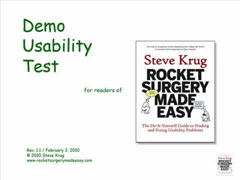
This is the short, practical manual for actually doing a test yourself, no training required. Krug walks you through running a simple session in a morning a month, and hands you the scripts, checklists, and a recording setup so you are not inventing the process from scratch. It pairs perfectly with the Nielsen article: one tells you why five users is enough, this one shows you exactly how to sit down and run it.
From
Steve Krug (New Riders)
by Steve Krug
About 168 pages
- You can run a useful test in roughly a morning a month, no lab and no research team needed
- Comes with ready-to-use scripts and checklists so you copy a working process instead of guessing
- Focus on finding the few most important problems, then fix them with the least you can do
Open
sensible.com →
📖 Book
✓ Link checked
Paid
Beginner
The most accessible, practical intro to usability ever written, you can read it in a weekend and immediately fix your product. The definition of 'make it obvious, not clever.'
From
sensible.com
by Steve Krug
~200 pages
- Self-evident design is the goal, kill anything that adds thinking.
- Users satisfice: they scan and click the first reasonable option.
- Cheap, frequent usability testing beats large formal studies.
Open
sensible.com →
📄 Article
✓ Link checked
Free
Beginner
This is the piece that gives you permission to stop waiting for a big study. Nielsen shows that just five people uncover roughly 85 percent of the usability problems in your app, and that running several small tests beats one large one because you can fix things between rounds. For a founder with no budget, it reframes testing from a scary research project into something you can do this week.
From
Nielsen Norman Group
by Jakob Nielsen
About a 10 minute read
- Five users find about 85 percent of usability problems, so you do not need a large sample to learn what is broken
- Running three small tests and fixing between them beats a single big study
- The rule holds for qualitative testing of a fairly similar user group, so split into small groups if your users are very different
Open
nngroup.com →
📄 Article
✓ Link checked
Free
Beginner
A clean primer if you have never run a test. It defines the three pieces that matter (a facilitator who does not lead, realistic tasks, and participants who look like your real users) and explains moderated versus unmoderated and qualitative versus quantitative in plain terms. Good to read before your first session so you set it up right.
From
Nielsen Norman Group
by Kate Moran
~12 min read
- Give realistic tasks, not questions about opinions
- The facilitator observes and never rescues the user
- Recruit people who resemble your actual target users
Open
nngroup.com →
📄 Article
✓ Link checked
Free
Beginner
This is the technique that turns watching into understanding. Ask users to narrate their thoughts while they work, and their confusion, wrong guesses, and moments of relief become audible. Nielsen argues it is the cheapest and most valuable method you have, and this piece is a quick guide to doing it well.
From
Nielsen Norman Group
by Jakob Nielsen
~6 min read
- Ask users to say what they are thinking as they go
- Their wrong guesses point straight at unclear labels and flows
- It is cheap, flexible, and needs no special equipment
Open
nngroup.com →
📄 Article
✓ Link checked
Free
Beginner
The single most-cited usability framework in the field, from the definitive UX research authority. A checklist you can hold your product up against this afternoon.
From
Nielsen Norman Group
by Jakob Nielsen
~15 min read
- Visibility of system status, always tell users what's happening.
- Match the real world, use the user's language and mental models.
- Prevent errors, and make consistency and standards the default.
Open
nngroup.com →
📄 Article
✓ Link checked
Free
Intermediate
The quality of your test depends entirely on the tasks you give. This piece shows how to write realistic scenarios that do not accidentally hand users the answer or hint at the click you want. Get this right and your test reveals genuine confusion, get it wrong and you only confirm what you hoped.
From
Nielsen Norman Group
by Marieke McCloskey
~9 min read
- Frame tasks as real goals, not instructions with the steps baked in
- Avoid words from your own interface inside the task wording
- A good task has a clear end state you can observe
Open
nngroup.com →
📖 Book
✓ Link checked
Paid
Beginner
The single best thing ever written on customer conversations. It teaches you to ask about the customer's life and past behaviour, not your idea, so you can't be lied to. If a founder reads one thing before talking to a single customer, it's this.
From
momtestbook.com
by Rob Fitzpatrick
~130 pages
- Talk about their life, not your idea.
- Ask about specifics in the past, not opinions about the future.
- 'That's so cool, I'd totally buy it' is a compliment, not data, dig for commitment and evidence.
Open
momtestbook.com →
✍️ Essay
✓ Link checked
Free
Beginner
The most memorable proof that watching users pays. A single confusing choice on a checkout form was quietly costing a retailer a fortune, and it only surfaced when the team observed real people stumble on it. Read it when you need to convince yourself, or a co-founder, that an afternoon of watching users is worth it.
From
LukeW / User Interface Engineering
by Luke Wroblewski
~6 min read
- One confusing button silently blocked huge numbers of users
- The fix was obvious only after watching people fail
- Small usability problems can carry very large costs
Open
lukew.com →
📖 Book
✓ Link checked
Paid
Intermediate
Most founders treat customer research as a one-time pre-launch exercise, then go quiet once the product ships. Torres makes the opposite case: the core habit is talking to a handful of customers every single week, run by the same people building the product, so learning never stops. This is the clearest, most practical playbook for turning discovery into a standing rhythm instead of a project.
From
Amazon
by Teresa Torres
~200 pages
- The keystone habit is weekly touchpoints with 5 to 7 customers, done by the team building the product, not outsourced to a research department
- Use story based interviews (ask about a specific recent experience) instead of asking people what they want or would do in the abstract
- Tie every interview back to a desired outcome using opportunity mapping, so research drives decisions rather than piling up as notes
Open
amazon.com →
📖 Book
✓ Link checked
Free
Beginner
Free to read online, with chapters like "Build Less" and "Half, Not Half-Assed" that name your exact trap. It argues that cutting scope is a feature, and that the version with fewer things done well beats the bloated one. A fast, opinionated read you can skim straight to the chapters that sting.
From
Basecamp / 37signals
by Jason Fried, David Heinemeier Hansson (37signals)
Free online, ~4 hr
- Build half a product, not a half-built product.
- Every feature you add is one more thing to maintain and explain.
- Deliberately underdo the competition on scope.
Open
basecamp.com →
📄 Article
✓ Link checked
Free
Beginner
The lowest cost way to watch real people use your product, no recruiting agency required. This guide walks through the coffee shop approach: approach a few strangers, offer a small thank you, and give them a task while you watch. When you have no budget and no users lined up, this gets you real signal by the afternoon.
From
Maze
by Maze
~9 min read
- Five to eight quick sessions surface most core problems
- Test in a cafe or campus, offer a small thank you
- If three of five stumble on the same thing, that is real signal
Open
maze.co →
📄 Article
✓ Link checked
Free
Beginner
This is Google's own field research on building for people coming online in markets like India, and it names the exact constraints you are up against: a 40 to 60 dollar phone with 512MB of RAM, a network that flips between 3G, 2G and nothing, and 250MB of prepaid data for the whole month. It is the clearest single primer on why a metro-built app breaks for a first-time user, and it stays concrete instead of preaching. Read it as a starting point for how you scope features, not as a checklist to blindly copy.
From
Google Design
by Google Design (Next Billion Users team)
~12 min read
- Assume slow or intermittent connectivity as the default state, not the exception: design offline-first and let the app degrade gracefully when the network drops.
- Data is expensive and rationed, so every megabyte you ship (heavy images, autoplay, background sync) is a real cost the user notices.
- Many users are new to touchscreens and English, so patterns you take for granted (swipe, hamburger menus, English CTAs) need rethinking for people building outside the big startup hubs.
Open
design.google →