My landing page looks great on desktop but breaks on mobile, how do I stop that from happening?
The short answer
Design the page on your phone first, because that's where most of your traffic actually opens it, then let desktop be the afterthought. In no-code builders this means checking every section in the mobile preview and fixing stacking, font size, and button tap targets before you ship. The most common breaks are images that overflow and text that shrinks to unreadable, so hunt those two first.
Go deeper, your way
2 hand-picked resources, 2 link-checked. Pick how you want to dig in.
▶️ Video
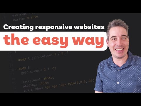
✓ Link checkedFreeBeginner
Why we picked it
Kevin Powell walks through why layouts that look fine on desktop fall apart on smaller screens, and the fixes are the exact culprits behind most mobile breaks: fixed pixel widths, missing flexible units, and clumsy media queries. He builds it visually so you see the break and the fix side by side rather than just reading rules. It is a practical starting point for anyone whose landing page shrinks badly on a phone.
Why we picked it
This is the free, built-in way to see exactly where your landing page breaks: open DevTools, toggle the device toolbar, and drag the viewport from a narrow phone width up to desktop. It is the fastest feedback loop because it is already in the browser you use every day, no signup or install. Treat it as a starting point for spotting the break, then confirm on a real phone since the simulator cannot reproduce everything.